


Inside the Scary Good Sets of Netflix’s ‘Wednesday’: Tim Burton and Mark Scruton’s Spooky Mastery
Since its 2022 debut, Netflix’s Wednesday has captivated audiences with its spooky, Tim Burton-inspired visual style. Rooted in the iconic Addams Family universe, the series blends gothic architecture, macabre humor, and supernatural mystery into a world that is eerily inviting yet delightfully sinister.
With the Season 2, Part 2 premiere now streaming, fans are treated to a richer, expanded Nevermore Academy, featuring intricate set pieces, imaginative interiors, and expansive exteriors that elevate the series’ already iconic aesthetic. Production designer Mark Scruton gives us a behind-the-scenes look at how the team brought this world to life.
Nevermore Academy: Where the Macabre Meets the Mystical
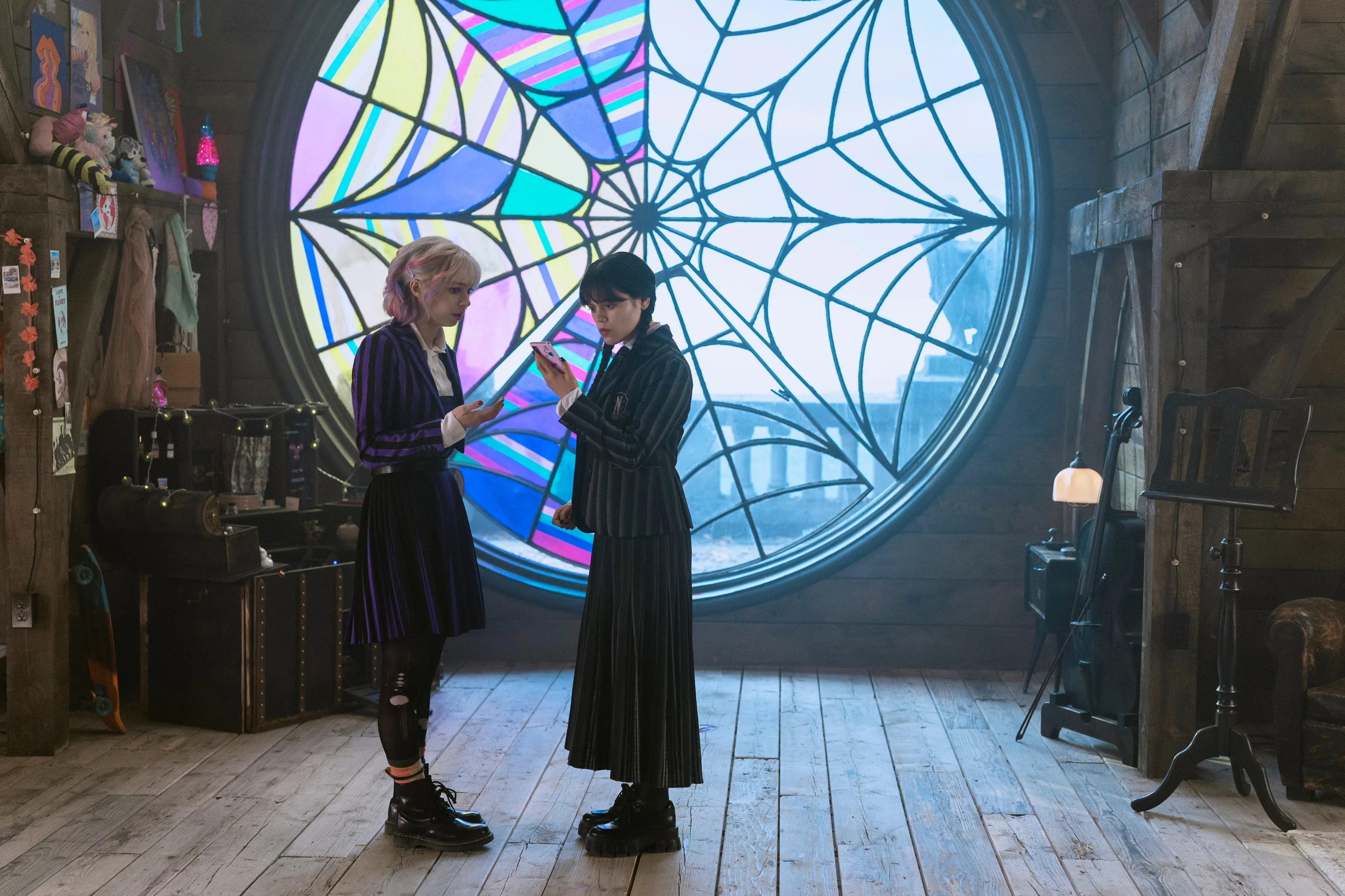
The series centers on teenage Wednesday Addams (Jenna Ortega) as she navigates mysteries, monsters, and murder at Nevermore Academy, a boarding school for outcasts. Here, cliques consist of werewolves, sirens, and other supernatural beings, offering a gothic twist on classic high school dynamics.
-
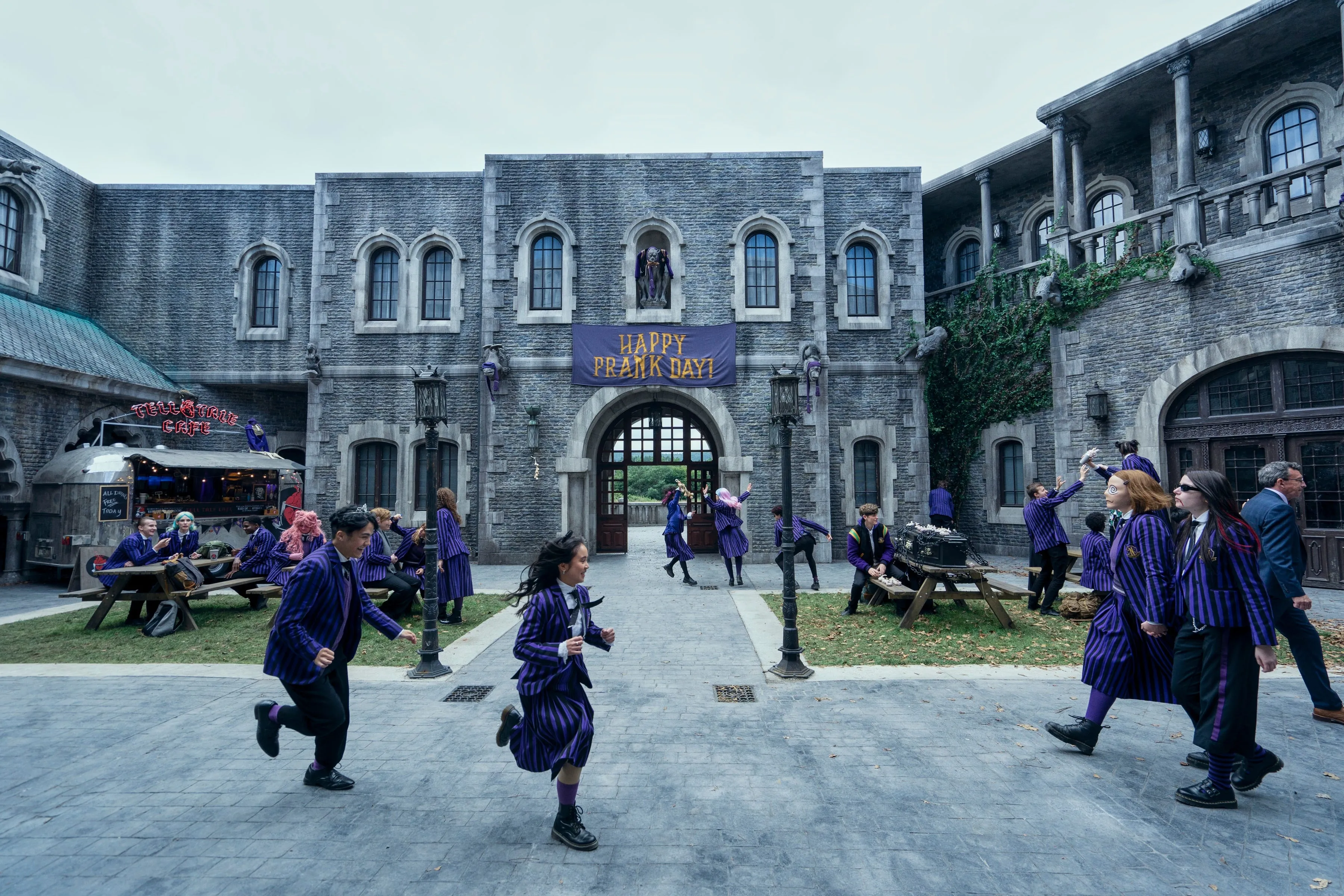
Gothic Architecture: Nevermore’s imposing towers, shadowy corridors, and courtyards provide a visual metaphor for the series’ eerie tone and adolescent exploration.
-
Vermont and Beyond: While the academy is set in rural Vermont, Season 2 moved production from Romania to Ireland, offering lush, organic backdrops that enhance the supernatural yet realistic world.
-
Expanded Campus: Ireland’s historic Charlieville Castle served as a backbone for new Nevermore sets, allowing the inclusion of Burton-branded gargoyles, expansive courtyards, and labyrinthine interiors.
Scruton notes, “We had to know that our world was here,” highlighting the strategic location scouting and set reconstruction necessary to capture Nevermore’s gothic grandeur.
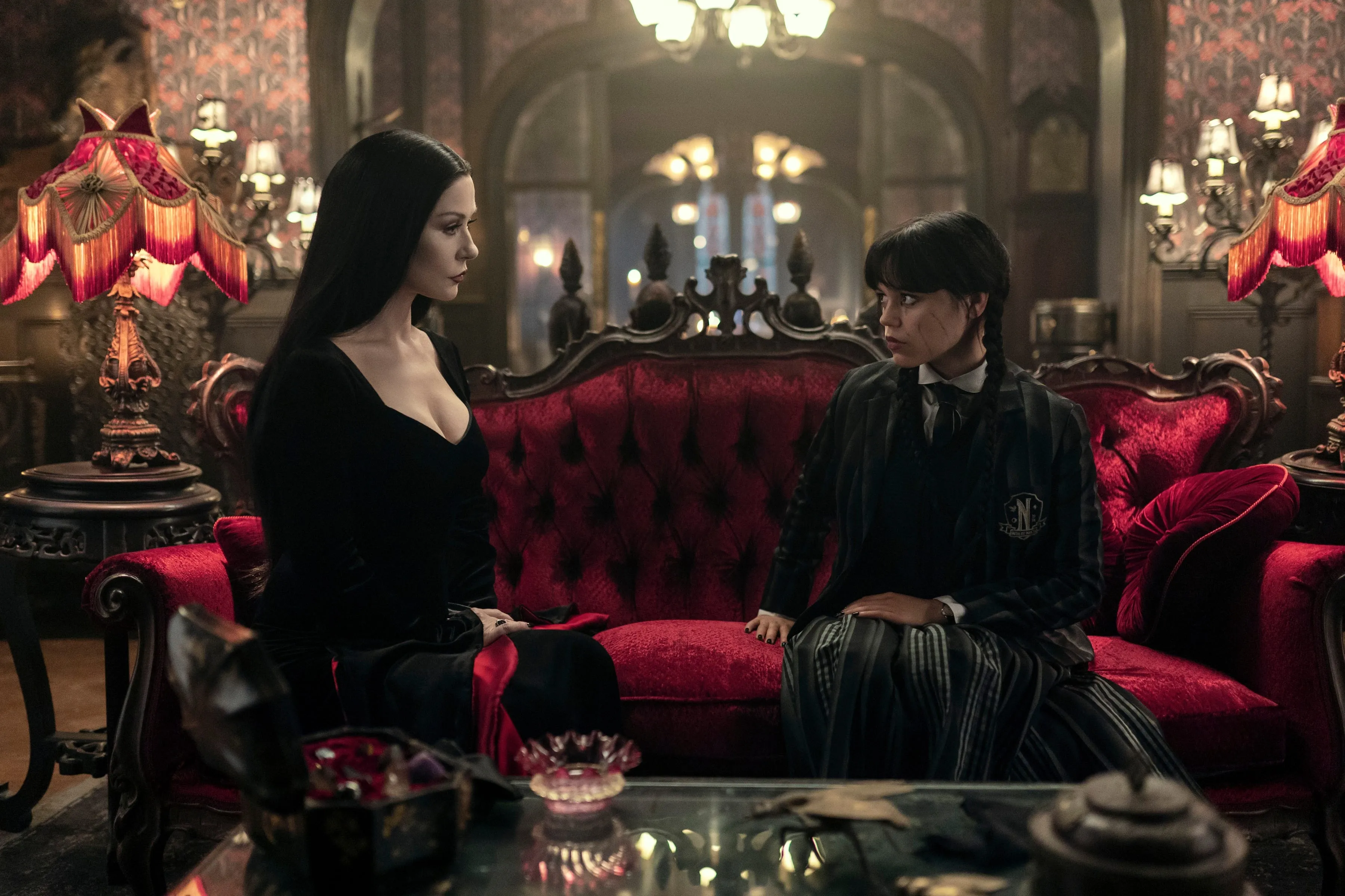
Jenna Ortega: The Petite Storm in the Center of It All
Scruton describes working with Jenna Ortega as a delight, noting how her petite presence contrasts with the grandeur of Nevermore’s sets.
-
Costume and Presence: Wednesday’s signature black attire makes her a “brooding little storm cloud” in the massive, intricately designed environments.
-
Producer Role: Ortega’s expanded involvement as a producer this season allowed her to influence both storytelling and visual aesthetics, ensuring alignment between character and environment.
The interplay of actor presence and set scale demonstrates how production design complements character development, creating an immersive experience for viewers.
From Beetlejuice to Wednesday: Burton and Scruton’s Design Language
Season 2 benefited from creative overlaps with other Tim Burton projects, such as Beetlejuice Beetlejuice. Scruton notes the “very similar language” in design approaches:
-
Visual Continuity: Shared motifs, such as darkly whimsical props and exaggerated architectural features, create a recognizable Burton-esque aesthetic.
-
Creative Expansion: With Season 2, the team aimed to push boundaries beyond Season 1, introducing larger, more elaborate sets and richer detail.
Scruton says, “I think we all knew we wanted to make a bigger world this time,” reflecting the intention to expand Nevermore’s visual and narrative scope.
Opera and Venetian Influences in Set Design
When Ireland’s natural landscapes couldn’t fulfill all narrative needs, Scruton drew inspiration from opera set design, particularly Richard Wagner’s Ring Cycle.
-
Grand Statements with Minimal Resources: Operatic techniques allowed the creation of visually striking environments without overextending the production budget.
-
Venetian Gala: Season 2, Part 2 culminates in a Venetian-inspired gala, featuring a canal, bridge, and ornate ballroom, all constructed in just two weeks using strategic set design principles.
These influences demonstrate how classical design techniques can enhance modern television storytelling, adding layers of spectacle to Wednesday’s gothic world.
Interiors: Macabre Meets Playful Homage
A tongue-in-cheek subplot involves Wednesday’s parents moving into the former Gardener’s Cottage, previously occupied by Season 1 villain Marilyn Thornhill.
-
Seasonal Contrast: Thornhill’s cottage featured pink, fluffy pillows and floral accents, a playful nod to the original 1960s Addams Family TV set, which was black-and-white despite its pastel interiors.
-
Morticia’s Redesign: Morticia transforms the cottage into a dark, macabre, black-and-red lair, including signature elements like a turtle-carved sideboard, fan chair, stuffed bear, and Venus flytrap conservatory.
-
Verdant Accents: The green plants provide a “pop of life” against the dark tones, creating contrast and visual intrigue.
Scruton’s attention to historical references, playful homage, and color symbolism enriches the interiors, giving fans layers of Easter eggs and design depth.
Prop Sourcing and Unique Details
Scruton and set decorator David Morrison Speaker spent extensive time scouring Ireland’s antique shops and Parisian flea markets to source odd, unusual, and inspiring props.
-
Custom Modeling: Many set pieces were created from scratch to align with Tim Burton’s vision.
-
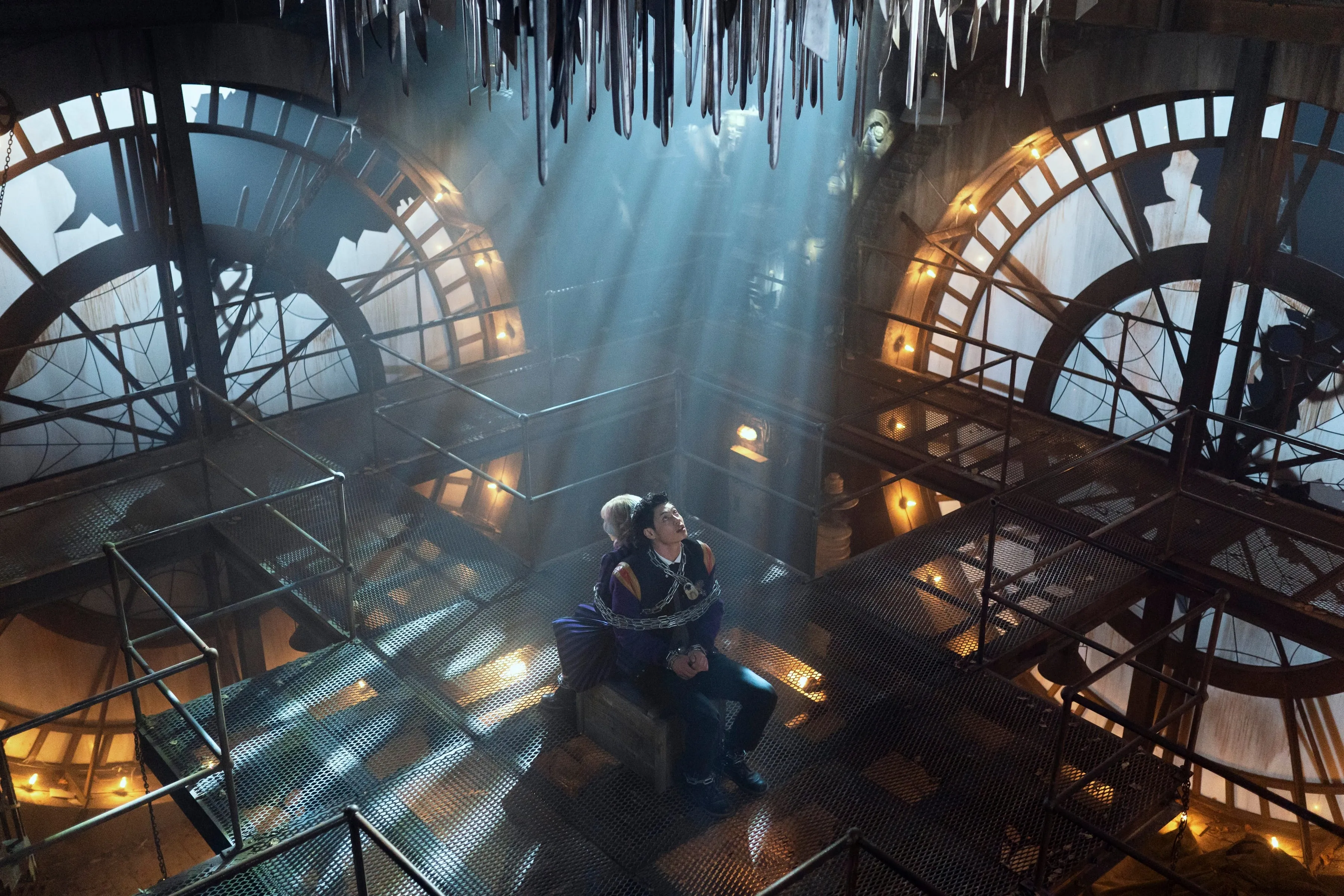
Small Details with Big Impact: Often, a single item—like a clock or a mechanical contraption—inspired the design of the entire set.
-
Mad Scientist Motifs: Season 2 introduces mechanical and scientific elements, such as a self-made mechanical heart, influencing set decor in locations like the biology lab, Willow Hill psychiatric unit, and Iago clock tower.
These intricate details reward attentive viewers, offering visual storytelling cues that enrich the narrative.
Season 2 Part 2: Bigger, Darker, and More Ambitious
This season’s expansion includes:
-
Rebuilt Central Courtyard: The heart of Nevermore Academy received a comprehensive overhaul, integrating historical architecture, gothic gargoyles, and sprawling landscapes.
-
Ireland’s Natural Beauty: Forests and estates serve as dual-purpose locations, doubling for both Vermont exteriors and supernatural environments.
-
Expanded Interior Sets: The interiors incorporate layered textures, eccentric props, and whimsical details, maintaining continuity while elevating the gothic tone.
Scruton emphasizes that bigger sets required faster production schedules, with a mix of practical construction, creative sourcing, and precise planning.
The Impact of Production Design on Narrative
The production design of Wednesday is more than just aesthetic—it actively shapes the story:
-
Character Immersion: Environments like the clock tower or biology lab reflect character psychology and plot points.
-
Tone Setting: Gothic corridors, shadowed rooms, and dramatic exteriors create a consistent, immersive atmosphere.
-
Storytelling Clues: Props, machinery, and unusual tech elements hint at plot developments and foreshadow key twists.
The seamless integration of design and storytelling makes Wednesday a standout example of how production design can elevate narrative in television.
Conclusion: The Magic Behind the Madness
Netflix’s Wednesday Season 2, Part 2 exemplifies how meticulous set design can transform a series, creating a visually rich world that is both terrifying and enchanting.
-
Mark Scruton’s Vision: Through collaboration with Tim Burton and Jenna Ortega, Scruton expanded Nevermore Academy into a larger, more intricate, and visually compelling space.
-
Attention to Detail: Every prop, color palette, and architectural element is designed to enhance storytelling and deepen viewer engagement.
-
Cultural Homage: The sets honor the Addams Family legacy while introducing new gothic aesthetics, demonstrating the show’s ability to innovate within a beloved universe.
As fans dive into Season 2, Part 2, they can appreciate the layers of craftsmanship, inspiration, and imagination that bring Nevermore Academy to life. From opera-inspired grandiosity to tiny, quirky details, the show’s production design proves that in Wednesday, the sets are as captivating—and as essential—as the characters themselves.


